
Reimagine Global Money Transfers
Redesign the Western Union money transfer experience
Western Union experienced a decline in digital sales with the rise of on-demand remittance services. In response, the company’s leadership launched a comprehensive mobile app redesign aimed at strengthening the brand, reducing user friction, enhancing customer relationships, and driving digital growth.
This case study delves into the journey of revamping the product to achieve these strategic business objectives.
The Challenge
Western Union aims to adapt to industry changes and become a leader in the digital remittance space. This project focuses on addressing challenges and seizing new opportunities in the fast-changing financial landscape. The redesign targets three key areas:
Boosting Brand Awareness
Refresh the product to fully leverage Western Union’s brand, increasing user awareness and building a stronger connection with customers.
Improving Compliance Experience
Make it easier for customers to navigate regulatory requirements, ensuring a smooth and confident transaction process.
Strengthening Value Propositions
Highlight compelling benefits to convert traditional retail customers into digital users, aligning with the shift towards on-demand remittance services and positioning Western Union as a market leader.
My Role
My role encompassed gathering marketing data and customer insights, formulating product and design strategies with product owners, collaborating with the brand and marketing teams to redefine the look and feel, advancing the platform, and strategically addressing user frictions.
Customer Insights and Market Research
I conducted customer insights with one other designer on the team, analyzed the competitive landscape, and then translated the findings into opportunities for improvements and innovation.
Product Strategy and Planning
I partnered with the product owners on defining the project by evangelizing customer goals and balancing business goals. We also prioritized and negotiated features for launch and beyond.
Design Execution, Validation, Handoff
I executed user journeys, wireframes, prototypes, and design specs as well as created scalable frameworks on iOS and Android and worked with the dev team on implementation.
Coordination and Leadership
I collaborated with cross-functional teams and presented works to gain buy‐in from executives and senior stakeholders throughout the entire project lifecycle.
The Approach
To speed up the app’s launch, the team was tasked with using the existing infrastructure for a faster and more cost-effective market entry. This strategy was both efficient and budget-friendly.
Navigating a Tight Timeline
The design and development of the mobile app were split into parallel workstreams, with my role focused on leading the design for the money transfer experience. Each feature followed a serialized process: once a design was approved, the engineering team began implementation.
A fixed launch date meant that design had to fit into an engineering-driven timeline. Milestones were dictated by engineering estimates, leaving limited time for design. Balancing a tight schedule with ambitious goals required close coordination and adaptability to meet deadlines.

Market Data & Customer Insights
The discovery phase drew on extensive market research, customer interviews, and user testing with the existing product. These insights were crucial in shaping the key features for the product’s launch version.
71%
Customer Loyalty
The primary segment includes migrant workers and individuals sending money abroad. Among these customers, brand loyalty stands at 71%, largely driven by the company’s retail services.
The leadership team believed that offering a competitive mobile product could further boost customer satisfaction.
50%
CSAT Score
Western Union’s Customer Satisfaction Score (CSAT) is 50%, based on responses to the question: “How would you rate your overall satisfaction with the service you received?”
It’s critical to identify the gaps behind the low score, as improving it could boost retention, strengthen customer relationships, and drive repeat business for a sustainable brand.
4
Major Customer Concerns
Research revealed key customer concerns:
Lack of transparency on fees
Insufficient tracking system
High effort required for compliance
Limited services in certain countries (underserved corridors)
The team believed these pain points could be addressed through improvements in the app.
200 +
Supported Countries & Territories
The business operates in over 200 countries and territories. Most U.S. customers send money to Mexico, China, India, the Philippines, Vietnam, and Guatemala.
As a result, optimizing the experience for these customers became a priority, especially through localization, with language support for these countries being essential.
200 +
US Banking Service Ranking
Western Union ranks #11 in the Banking and Financial Services Industry, just behind Goldman Sachs and ahead of Bank of America.
The leadership team believed this ranking could be improved by delivering a customer-centric digital money transfer experience.
Cash Pay
User Behavior
Many remittance senders prefer cash for several reasons: they may be undocumented, fear deportation, want to avoid taxes, or dislike the paperwork involved in setting up bank accounts.
To meet their needs, the mobile app must include support for cash payment options, making it a crucial feature.
Mission Statement
Through initial research, our team established a clear vision. Our goal for the new Western Union mobile app is to offer the best value service, facilitating quick and easy international transactions. Therefore, we prioritized personalization, tailoring experiences to match customers’ needs, goals, and desires:
Make cross-border money transfers as effortless as sending a message.
Audit the Existing Product
Learning from past experiences is crucial, so the team started by taking a holistic approach to analyze the pre-existed product. A comprehensive user flow map was created in the process and from there, problems and customer friction were defined.
Mapping out the user journey allowed us to identify gaps and use the findings as benchmark during the development of new design strategies.

The Design Principles
Once the problems and gaps were identified, the team established design principles to guide decision-making. These principles aligned our vision, emphasized customer satisfaction, and increased our chances of success.
#1 Show Customers What We Know
Present value in a way that earns customer trust—make it specific, clear, unique, and actionable.
#2 Personal and Personalized
Financial services are personal and private. Focus on growing with customers and providing tools that give them control over their experience.
#3 Lead with Meaningful Content
Value-based content is key. When we don’t know the customer yet, quickly offer content that appeals to them, guided by popular trends or customer preferences.
#4 Avoid Dead Ends
Most interactions aren’t one-time. Anticipate the next step and design the experience to support it.
#5 Design Experience at all Stage
Consider the entire customer journey—'unaware', 'interested', 'first-time', 'regular', and 'passionate'—and evolve with their needs at each stage.
#6 Fit and Finish Matters
Pixel-perfect design, clear copy, and thoughtful details build trust with customers. Every interaction adds to the overall product experience.
Turn Friction Into New User Flow
To define core flows and key user needs, I revisited research insights and analyzed competitors’ products. This approach helped shape a user journey that aligns with customer thought processes and industry best practices.
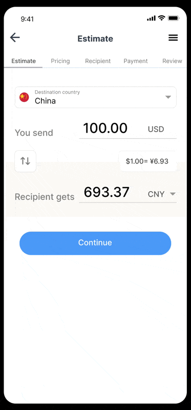
Prioritize Pricing Estimate
The pricing step is placed upfront to address cost concerns, providing transparency and building customer trust.
Simplify KYC
Know Your Customer (KYC) is a mandatory compliance step for highly regulated products. The focus here is on simplifying this process to reduce information overload for users.Streamline Checkout
These steps are optimized for a quick and seamless checkout, crucial for driving conversions and revenue growth.

Co-Create Ideas Into Strategic Pathways
When developing the design concepts, I followed a structured process involving requirements gathering, consensus building, and approvals to move to high fidelity phase.
I collaborated closely with fellow designers, product owners, and engineering through brainstorming and white boarding.
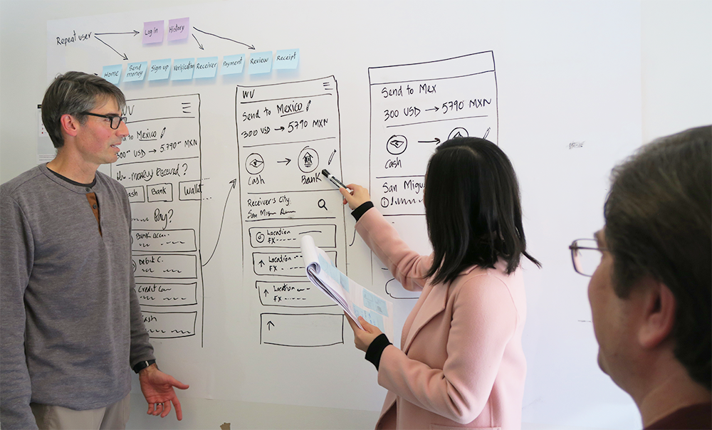
Product Image Refresh
Once stakeholders approved the design proposal, I began translating the wireframes into high-fidelity design comps.
As part of creating a fresh style for the product, I collaborated with the design system team to develop new components and visual elements for the library.

Stand Strong Through Validation
Prototyping was essential for validating assumptions and gathering feedback for improvements. The prototypes I created were also used in user testing.
I developed detailed testing plans to involve customers directly. The main objectives of these tests were threefold:
To thoroughly review and refine the new user experience
To assess the performance of newly designed features and components, ensuring smooth integration with the overall product ecosystem
To identify any user friction points, providing valuable insights for future enhancements.
Align With Customer Goals
After gathering extensive customer feedback and insights for user tests, I organized the data into key categories. I then developed a comprehensive proposal, strategically addressing the most significant risks identified for the upcoming launch.
Make order summary quick and easy
Testing showed that participants spent too much time on the order summary.
To speed this up, I restructured key details like payment options, exchange rates, and fees to more prominent positions, improving visual hierarchy and making the interface easier to navigate.
BEFORE
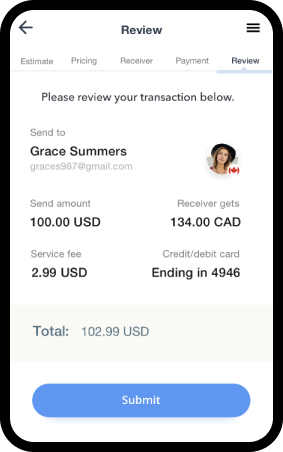
The original proposal was difficult to scan and lacked a clear visual hierarchy.
AFTER

The iteration prioritized key information for customers while improving the hierarchy.
Compliance errors can be prevented
When sending money from the U.S., regulations mandate the use of a legal name and mailing address on file; failure to do so will result in transaction errors.
To improve security and prevent errors that could lead to a negative user experience, I added prompts at multiple touch points to encourage profile completion.
PROFILE ALERT

The global banner reminds customers to complete their profile and provides a shortcut.
FRAUD PROTECTION
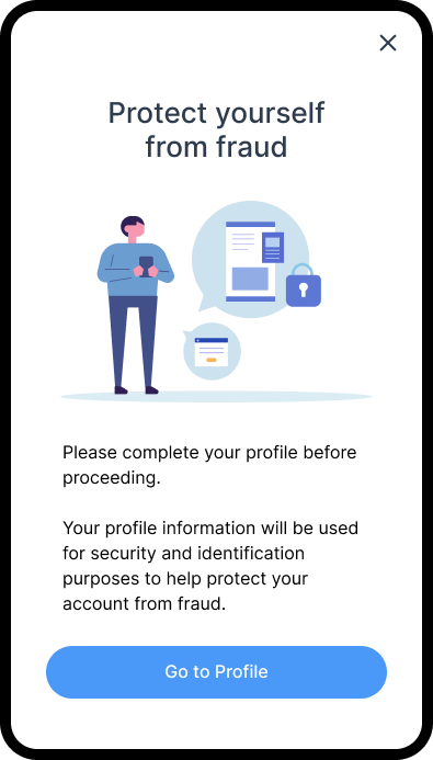
Customers with incomplete profiles are redirected to an interstitial to complete the action before proceeding.

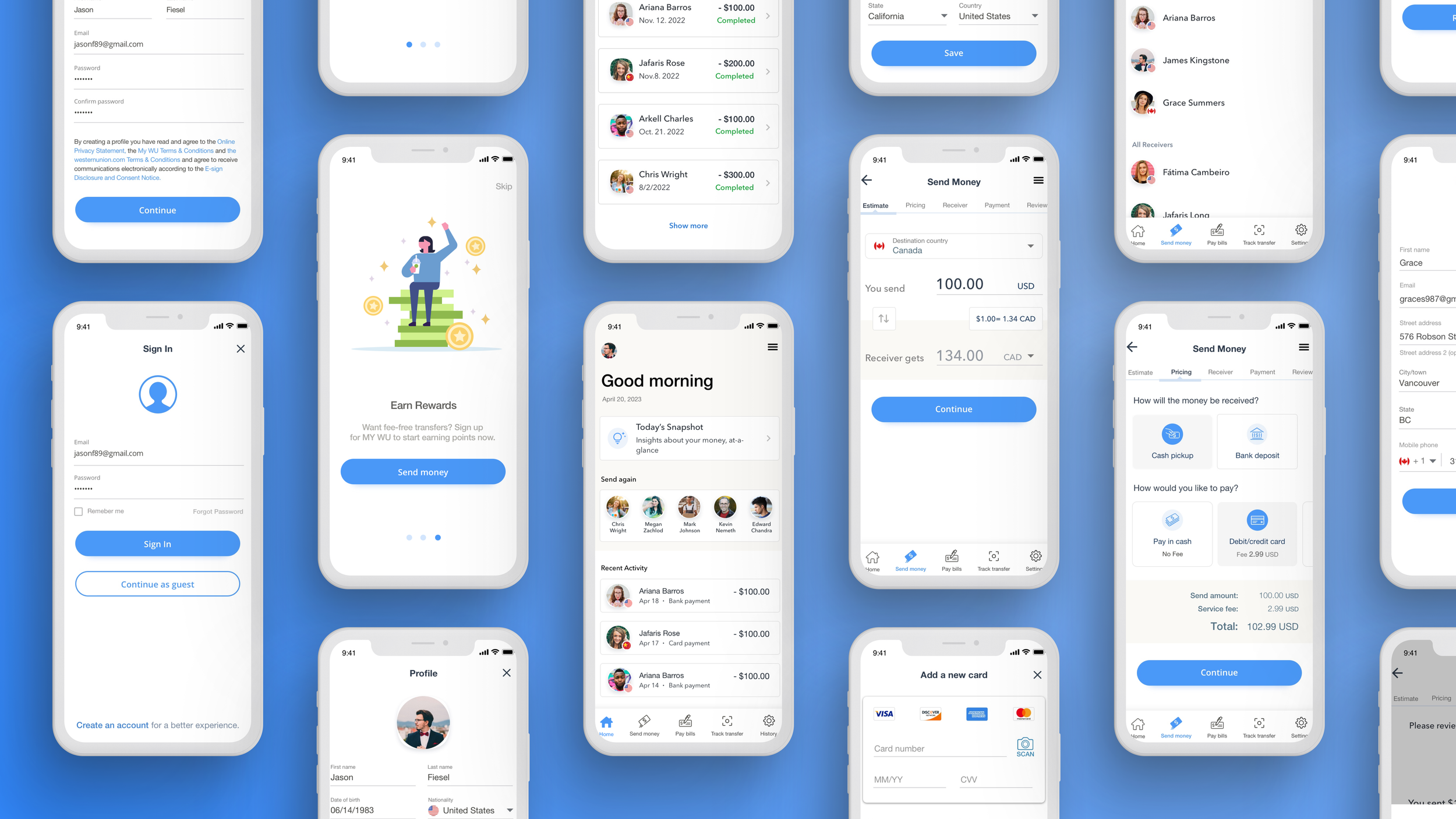
Bring the Product to Life
Despite the tight timeline, the team focused on refining the design to ensure a seamless user experience while balancing the needs of the business. Now, I’d like to present the final product and highlight its key features.
Frontload Clear Value Props
Value proposition screens at the start of the journey give customers a clear view of the product’s benefits, supported by a welcome framework and animated SVGs for richer presentation.
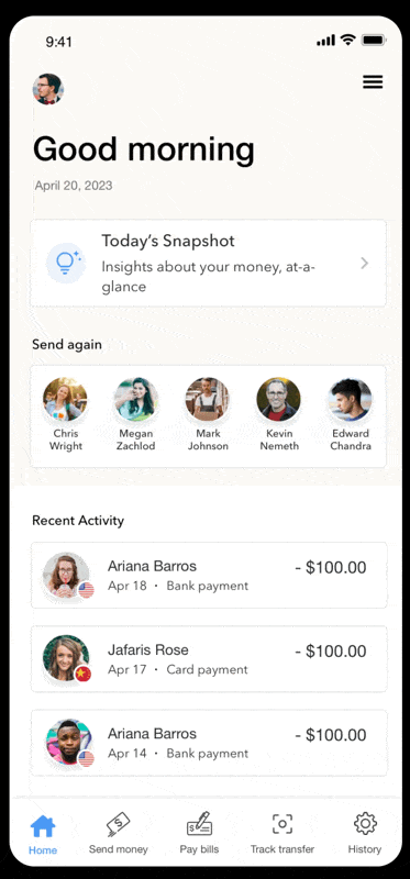
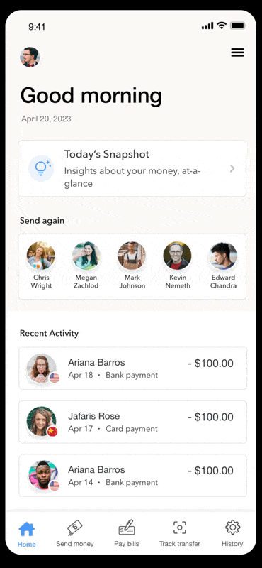
Build Transparency & Trust via Dashboard
Existing customers land on a dashboard with recent activity and a shortcut to resend—a common remittance behavior.
Price Estimate Makes Informed Decisions
Research shows transparency is critical to customer trust. The onboarding flow now features Estimate and Pricing steps to provide clear, comprehensive information from the start.
Safeguard Growth via Risk Management
KYC ensures accurate risk assessment and personalized guidance, while giving returning customers a faster, more efficient experience.
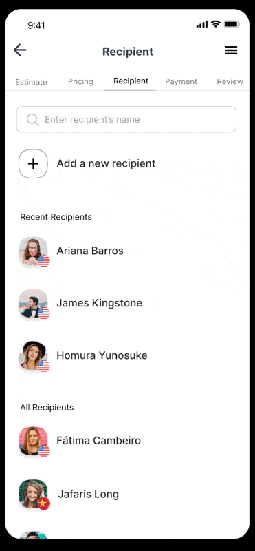
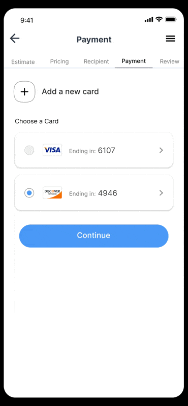
Streamline Checkout Process
Secure, accurate payments are streamlined with pre-filled details, instilling confidence and fostering customer trust.
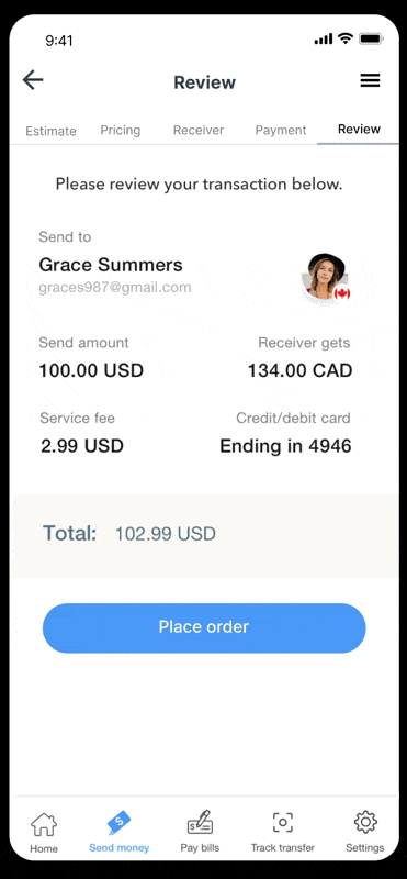
Order Summary Builds Customer Confidence
A review step enhances transparency, minimizes errors, and improves both service quality and conversions.
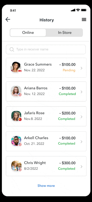
Transaction Tracking is Just As Important
A confirmation page with status, tracking, and delivery details ensures transparency and customer confidence
Seamless Access to All Features
The Western Union mobile app goes beyond money transfers, offering bill payments, transfer tracking, retail locations, rewards, and more. These features are easily accessible through the global menu button.
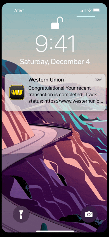
Continuous Engagement via Push Notification
After a transaction, the app sends status updates via notifications (with permission), fostering user engagement and encouraging repeat use with added incentives.
Move Money For 150 Million Customers
Product design is a dynamic, iterative journey—shaped and elevated through constant user feedback. Insights from tested regions revealed remarkable improvements: higher registration conversions, increased transaction volumes, and stronger customer satisfaction.
These outcomes underscore the power of listening, learning, and refining to create experiences that truly resonate.
+25%
SIGNUP RATE
The Signup rates increased from 16% to 25%.
+37%
CHECKOUT CONVERSION
First-time customers’ transaction conversion rates rose from 28% to 37%.
4.0 +
CUSTOMER SATISFACTION
Google Play Store ratings improved from 3.8 to 4.0 and Apple Store ratings increased to 4.5.
Key Takeaways
In the end, designing a global money transfer app isn’t just about great UX—it’s about aligning design with business goals while balancing compliance needs and technical constraints. Prioritizing scalability, security, transparency, user engagement, and simplicity can create a product that not only meets customer needs but also drives growth and loyalty.
Scalability is Crucial
Designing an app for global use requires flexibility. The design needs to accommodate various regulations, currencies, and localized needs across different regions. It’s important to create a system that scales easily as we expand into new markets while keeping the user experience smooth and consistent.
Balancing Security and Simplicity
One of the biggest lessons was finding the right balance between security and user experience. Financial data is highly sensitive, so ensuring compliance with regulations (like KYC and AML) is non-negotiable. At the same time, the design must allow users to complete transactions quickly and securely without feeling overwhelmed by security checks. Simplifying complex processes without compromising on security was key.
Transparency Builds Trust
I saw firsthand how transparency in fees and transaction costs directly impacts customer trust. Being upfront about fees, exchange rates, and expected transfer times helped users feel more in control of their transactions. Avoiding hidden costs and ensuring everything is clear and accessible leads to greater customer satisfaction and retention.
Tracking and Follow-Up Matter
Offering real-time tracking and post-transfer follow-ups was a game-changer. Keeping users informed every step of the way reduces anxiety and builds trust. Plus, reaching out after a transfer to gather feedback helps improve future experiences and fosters a deeper connection with customers. It’s a simple but effective way to keep users engaged.
Intuitive Design Reduces Friction
The project reinforced how important an intuitive, easy-to-use design is when dealing with sensitive financial transactions. By reducing complexity and making the process straightforward, users feel more comfortable and confident using the app. Making security features feel natural and unintrusive is key to building trust and ensuring customers return to the platform.